According to an article published on the Les Échos website in February 2018, Google reaps around $100 billion in revenue every year . This colossal amount underlines the Internet giant's dominance in the market. Since its creation, its logo has continued to evolve over time and space. Discover the famous history of the Google logo .
The Google logo: what is it?
Definition
The Google logo is a typical illustration used by the largest American search engine : Google. This is a graphical representation of the large firm and the search engine. It is also visible on the Internet from various media. It has had its own font from its creation to the present day. The creation of the different versions was taken care of by numerous designers, including Ruth Kedar . This Google graphic representation is regularly subject to modification: each time a particular event is celebrated on a national or even international scale. Thus, the logo modified for this purpose is known as Google Doodles. Literally, this name means scribble. The first Google Doodle was designed to pay tribute to the Burning Man festival (artistic meeting organized annually in Nevada).
The meaning of the term Google
The term Google refers to a mathematical term. Indeed, the creative team had first thought of Gogol. This expression refers to a number of 10 to the power of 100. The two creators of the company: Larry Page and Sergey Brin asked computer science students to suggest some names for their company. One of the students opted for googolplex. This is a more colossal mathematical term than gogol. The two members of the creative team then simplified the name to Google. Moreover, this expression perfectly conveyed the organization and heterogeneity of online data volumes. However, the history of the appearance of the word Google offers three versions:
- The first version talks about an error that occurred when entering the gogol text into Google.
- The second version relates that the two founders Brin and Page chose a term closer to googol and more practical: google.
- Finally, a third theory suggests that Google is a tribute to Lego (plastic brick games). Moreover, the color of Google letters refers to the colors of the bricks.
Steps for creating the Google logo
The creation of Google logos comes in 4 steps. The design teams of the large firm come together to focus on the development of a new logo. The teams work according to 4 guidelines:
- First, the new logo calls for a responsive identity. These are the procedures for manufacturing the logo in order to automatically adapt to the resolution of each screen of the users' terminal.
- Then, the new Google logo must have a living identity in order to interact with the Internet user.
- Then, the new logo must be consistent with the brand's other products.
- Finally, the new Google logo must display an elegant design in line with the evolution of technology.
Therefore, each company logo reveals a dynamic identity suitable for all media and consistent with other Google products.
The history of the Google logo
From the year 1997 to 1999
Here is the history of the real history of the Google logo:
- In 1997, Google was solely a research project at Stanford University. In addition, this version displays the GOOGLE letters in a somewhat simplistic 3-dimensional version.

- In 1998, this university project fortunately expanded further. The design has indeed evolved. Especially since Sergey Brin used open source image processing and creation software: GIMP (GNU image manipulation program). This version offers a current design and ends with an exclamation point. This point was borrowed from the Yahoo! logo.
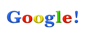
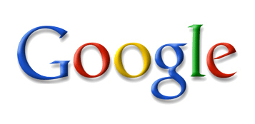
- In 1999, Google published a new version of its logo. This new logo has eliminated the exclamation point and displays a more modern design. Designed by Ruth Kedar, this version has remained unchanged. Additionally, this new logo features a custom font from Catull .
From the year 2010 to 2013
Since the 1999 version, Google has not made any visual changes in the 10 years that followed. However, from 2010, the need for a new modification was felt.
- In 2010, the American company opted for a further modification of the Ruht Kedar logo. The large firm has thus published a new logo adorned with bright colors and less pronounced shading.
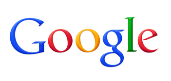
- In 2013, the Windows operating system saw considerable development in its computer programs. Indeed, the range of operating systems has integrated new designs into its software. So, responsive design has started to gain momentum in the mobile web and mobile devices. However, Google has only made a few minor changes to its 2013 logo. Thus, the American firm has kept the Catull font and the colors have undergone some minor adjustments.
From 2015 to the present
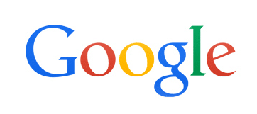
Another change in the Google logo was initiated in 2015. This modification is among the most significant. In fact, the company has decided for the first time to abandon the Catull font. Consequently, the large American firm opted for a new font designed especially for its logo: Product Sans . This typology is suitable for all media. The logo got rid of its serifs (the small extensions of characters present in serif fonts). Furthermore, Google wanted to keep the simplistic look of their logo and opted for a modest, but current design. The American firm will make further modifications in the years to come. Obviously, future logos will retain the originality as well as the simplicity of the American firm.
Characteristics of the Google logo
The symbolism of colors
The alternation of colors is essential in the history of the Google logo. Indeed, the company has retained blue, red, orange-yellow and green in its logo throughout the innovation procedures. The selection of colors has been carefully thought out. They each convey an important message:
- Blue in the G represents confidence, strength, reliability.
- The red in the first O and the E convey youth, boldness and emotion as well as excitement.
- The orange in the second O speaks of optimism, warmth and clarity.
- The green in the L symbolizes serenity, growth and health.
These colors constitute primary colors (colors that can create other colors by mixing them). However, green is excluded from the list because it is a secondary color. In this way, Google underlines its determination to surpass itself and maintain its creative spirit. Designer Ruht Kedar explains that this color selection expresses the fact that Google “doesn’t follow any rules.”
The G of Google
The G in Google is the company's favicon . It is a computer icon representing a website or computer program in the address bar, bookmarks, tabs and shortcuts of browsers. The G favicon brings together the 4 key colors of the logo: blue, green, red and orange. The company has integrated material design (Google's set of design rules for software graphical interfaces) into its favicon.
The latter first took the appearance of a simple blue G. However, developments in design require the firm to adapt its logo and favicon to new typographic requirements. Especially since G is now suitable for all existing formats. However, this new format is the subject of controversy due to its resemblance to the Qwant favicon (French search engine that appeared recently). Moreover, Qwant wants to take the matter to court to demand justice.
Why change the Google logo?
The latest modification constitutes an evolution of the company and not a simple update of the logo. Indeed, the company emphasizes that this change recalls the characteristics of Google: simplicity, clarity, user-friendliness.
- To adapt to different devices
This modification was motivated by the adaptation of services to the expectations of connected consumers. Thus, the new logo aims to adapt to all existing devices, in this case smartphones, tablets, etc. In other words, this change reflects adaptation to the digital age and anticipation of the future. Obviously, this new adaptation concerns all Google brand products. Furthermore, Larry Page and Sergey Brin confirm that the firm's visual identity will continue to evolve over time.
- For marketing
This operation is crucial from a strategic marketing point of view. Especially since a logo conveys the intentions of the company. This regular modification demonstrates the firm's adaptation to the consumption habits of Internet users. Moreover, the company stressed that this change reflects the reality regarding new consumer behaviors.
- To avoid the risk of fatigue
According to typography expert David Rault, seeing the same logo for a long time eventually tires the user. Indeed, a company can be described as old just by its logo that has remained unchanged for years. This is also the case for the IBM company, again according to the expert. Therefore, regularly changing the Google logo gives it eternal youth. Especially since this operation promotes a good image of the growing company.

